Art 54 |
||||||
|
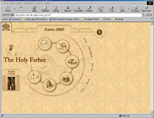
Project NineFlexibilityEaster has just been celebrated. During this period of time, I was looking for various explanations and found a large number of websites devoted to the object of my research. My browsing got more specific and I decided to concentrate on the Catholic faith. The Vatican 's website has a serious and official feel and the layout is strict and simple. The navigation is easy to follow, so that the viewer can find the information he/her is looking for. The graphics are subtle and work well for this topic.
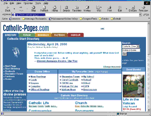
The Catholic Pages website has another type of look. The page layout is very actual and business-like. It gives me the impression of being on a stock-related website or even on a online bookstore. I do not feel the presence of a religion and there are not too many graphics. I like the clean and crisp look and the simplicity of navigation.
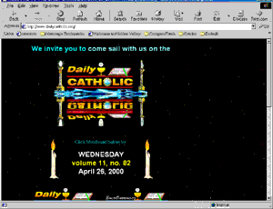
The Daily Catholic website has all together another style, very flashy, lots of animation. I do not enjoy the layout, or the colors. The black background doesn't seem to be appropriate in this context.
The content of these three websites seem to be very similar. They have a large amount of information about the Catholic religion, history, important events and many links to other websites. It is very difficult for me to judge if the content is fair, I am not an expert, but from what I have seen, all have the same goal: put as much information possible at the disposition of the viewers. I noticed that some type of page layouts are more inviting than others. They convince me to enter the website, because I enjoy what I see and I want to see and know more. It is interesting to see how a topic can be viewed from different people and here comes the concept of flexibility. I think you can pick any topic and its expression will be very flexible, depending on who is expressing it, for what reason and with which background. We all view concepts, objects in our very own way. |